Keeping eyes on the road aided by colorful, simplified HUD systems
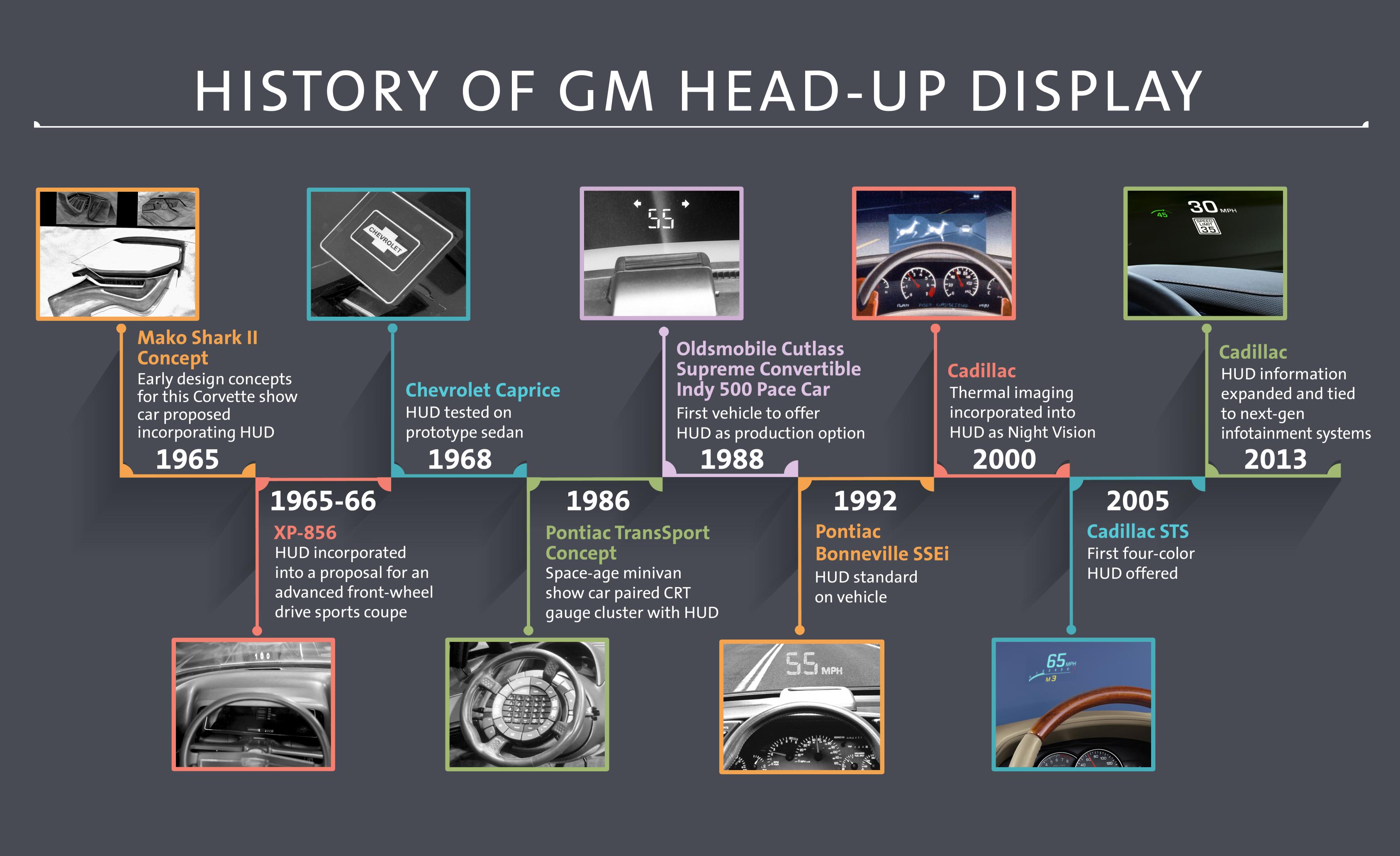
DETROIT – In the days of wearable technology that connects you to the world around you, the automotive head-up display, or HUD, is a seasoned veteran. General Motors pioneered the system decades ago, yet its design teams continue to refine both appearance and functionality to help reduce driver distraction.
“We know that keeping eyes on the road is critical to safe driving – and recent studies back this up,” said Jeff Boyer, vice president of GM Global Vehicle Safety. “Head-up displays can play an important role in maximizing ‘eyes-on-the-road’ time, and that’s what we’re striving for.”
The Virginia Tech Transportation Institute’s 100-car Naturalist study showed that the odds of a crash or near-crash more than doubled when a driver’s eyes were off the road ahead for more than two seconds. In 2013, the National Highway Traffic Safety Administration released a study that concluded that visual and manual distractions – such as dialing or texting on a handheld phone – increased between two and three times the risk of getting into a crash.
By projecting pertinent information onto the windshield and into the driver’s line of sight, head-up display systems allow drivers to keep their eyes on the road ahead instead of glancing at gauge clusters, infotainment screens and other devices. GM research shows drivers can spend 134 milliseconds shifting their gaze to a gauge cluster and back to the road. At 70 mph, a vehicle can travel 13 feet in that time, roughly the average length of a passenger car.
There’s far more work involved with developing HUD systems than just creating hardware: careful attention is paid to how the display looks and how it interacts with both the driver and other systems within the car.
“We have to make smart decisions about what content goes into the HUD,” said John Weiss, an interaction designer for HUD systems, “and how we can then present it to the driver in a manner that’s easy to read and intuitive to use.”
Simplified Screens
Today’s head-up displays, offered on more than 30 percent of GM vehicles sold in North America, can provide far more information than the first production system introduced on the 1988 Oldsmobile Cutlass Supreme. To reduce clutter, drivers can select from screens that focus on navigation, audio information, a tachometer, or simply a speedometer.
“The HUD screens are tailored to the driver,” said graphic designer William Thompson. “We do lots of prototyping, where we mock up different arrangements or graphics and get feedback from users.”
Fine Lines and Fonts
Compared to a gauge cluster or infotainment touchscreen, the head-up display space is constrained, forcing designers to work within a limited space. Designers inherently “think small,” but legibility restricts how far elements can be downsized. Icons are simplified, and lines must be at least four pixels wide. Fonts typically considered “grotesque,” – meaning letters are distinct and discrete from one another – are used.
Choosing the Right Colors
The use of a full-color screen allows designers more flexibility in selecting what colors to project. Each hue in the display is carefully selected to ensure it projects well and appeals to the driver.
Real-world testing helped the design team finalize color selections. White – the brightest color in the liquid crystal display, or LCD – is used for most fonts and displays. Winter testing helped find a hue that didn’t disappear against a snowy background. “We’ve done quite a bit of legwork to see what colors work best on the road,” said Weiss. “Some colors might look good when viewed on a computer screen but appear quite different when projected on a windshield.”
Simple Controls
Although the head-up display duplicates information shown elsewhere on the instrument panel, it doesn’t require a second set of controls. “You might have an incoming call notification pop up on both the gauge cluster’s driver information center and the head-up display,” says Weiss, “but you don’t have to dismiss each one separately. We make sure the control interface on the steering wheel can interact with both displays.”
In order to further reduce complication, HUD-specific controls largely focus on adjusting the screen’s height and brightness to the driver’s liking.

